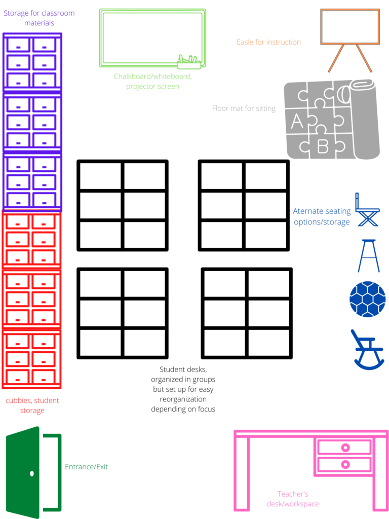
This post will outline my plans for how the physical layout of my classroom will look. When drafting a layout for a classroom, I considered some key elements:
- Student needs: allergy, wheelchair (mobility accommodations), hearing, eyesight, etc.
- What is the Focus for desk structure? Teacher instruction-focused or groupwork/collaboration-focused?
- What messages or art can be displayed?
- Can seating be flexible?
- What seating options are available to me?
- Space available
- Lighting and lines of sight

In this classroom plan, I placed the teacher’s space in the back of the class to be out of the way and non-distracting yet still easily accessible for students. Furthermore, the desk faces the board/projector screen so that multimedia presentations can be seen when planning before/after class.
I have the desks organized in pods to collaborate easily. however, students can easily organize them into rows for teacher-centric instruction. Students can also organize them in a circle or u-shape for discussions and collaborative activities.
I left space around the entrance/exit for safety concerns and easy access. Furthermore, I placed the entrance at the back of the class so that ins and outs were of minimal distraction.
Throughout the classroom, I made clear pathways for easy mobility and spaced everything out as evenly as possible to minimize the sense of clutter.
A group sitting space with an easel for board work is at the front of the class for instructional activities. This creates intimacy and an alternative form of sitting and teaching. I planned this to provide diversity in instruction and setting.
The children’s lockers/cubbies/storage is on the same wall as the entrance/exit, so mess is minimized, access is easy, and students can retrieve items with minimal distraction to the rest of the classroom.
The storage area for materials is on the same wall as the student material storage for the same reasons.
The alternate seating options are on the far wall, with clear, wide safety pathways when switching seating options. Some examples of the alternative seating options could include:
- Wobble stools
- stools
- cushioned chairs
- exercise ball-type seats
- lap-desks
- foam stools
- rocking chairs
- director-style folding chairs
If my classroom had sufficient space, I love the idea of different areas that could serve as stations for different activities; These could include reading areas, play areas, computer areas, silent areas, etc.
In my blueprint for seating I couldn’t display any spaces for art or different messaging that will be on the walls. Some ideas for wall space may include:
- Visual art (drawings, paints)
- Positive messages
- Student work
- Art wall
- Creative space for students, whiteboard, paper wall for drawing/colouring etc.
- Educational messages/material: words, letters, numbers, key concepts etc.
- Emergency information
- Emergency supplies: fire, earthquake, lockdown supply bag.
- Allergy notifications
- emergency procedure lists
To conclude, the classroom’s physical aspects are a piece of the larger picture, which is classroom community and management, all of which are interconnected and co-dependent. Therefore, the aspects of my other posts on this assignment apply to my physical classroom planning. Additionally, the classroom layout is dependant on the characteristics of each separate class, so it must be flexible.

Leave a Reply